Good day everyone!
Here are the charts from my study on the real estate market in the Brockville area. There is currently about a month’s worth of data in the study but we will continue to grow.
The overall over ask percentage is still holding strong at around 25%. This means that on average, homes are selling for an additional 25% over the asking price.
Hopefully, this data helps you on your own home buying journey. Good luck!
Disclaimer: Please remember this is not financial advice and we’re definitely not experts. Take these numbers with a grain of salt. The intention is to paint a picture of the RE market in our area. All of this information is pulled from publically available sources.
About The Study
The goal of this tracking project was to help me in my own home buying journey. I had no clue what I was doing and wanted to better understand what the market looked like.
My theory was that if home prices are going to come down, the over-ask spread would be an early indicator. As mortgage rates begin to rise, demand should begin to drop. The rising cost of goods these days might also contribute to lower demand.
With mortgages and budgets tighter, the ability to overbid a crazy amount should also drop. Leading to fewer bidding wars, smaller overbids, and hopefully, lower home prices.
A good theory, but I’m sure there are variables missing from the equation to create a highly accurate model. The data in this study should provide a good high-level overview of the current state of the real estate market in our area.
Overall Numbers
All homes were under $300k, we have begun tracking homes under $400k but need a few weeks for the data to catch up before we publish.
Below are the average over-ask percentages for the past 30 days.
Overall
Avg Over-Ask % Past 30 Days
23.13%
$200k-$300k
Avg Over-Ask % Past 30 Days
24.82%
Alright, time for some fun charts.
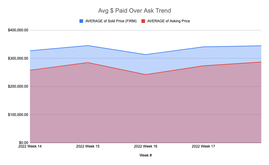
The average $ paid above the asking price over the past few weeks. This chart is set to track the last 90 days so eventually, we should see 3 months of trend. If my theory is right, the blue and red lines should converge at some point.
I think this is essentially just tracking whether or not we’re in a buyer or seller’s market.
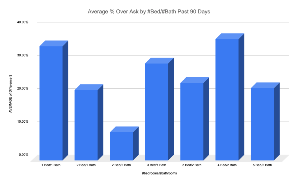
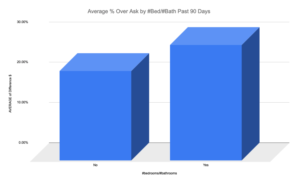
#Bed/#Bath % Past 90 Days
Below is the average % paid above ask by # of bedrooms and # of bathrooms over the past 90 days.
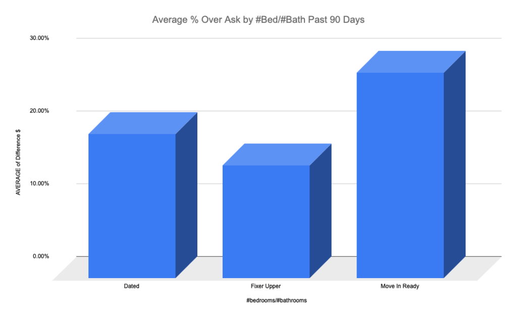
House Condition % Past 90 Days
Here is the average % paid over ask by the condition of the home over the past 90 days. This is a subjective metric as I used the images of the home to determine the condition.
Garage % Past 90 Days
This chart shows the % paid over ask by whether or not the home came with a garage. Again, the past 90 days.
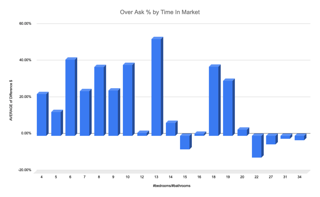
Over Ask by Time In Market
An interesting chart, this one shows the % paid over ask by the time the home spent in the market.
The $200k-$300k Asking Price Range
All of the charts below were created using data from houses with an asking price between $200k and $300k. The data is from the past month but eventually will show the past 90 days.
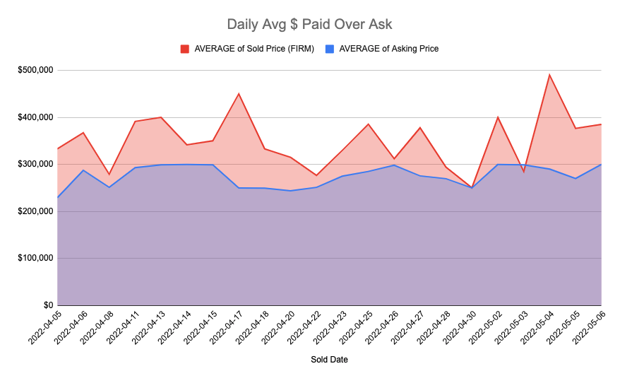
Daily Over Ask $
This chart shows the dollar amount paid above ask on a daily scale. Pretty much useless right now since it’s so erratic.
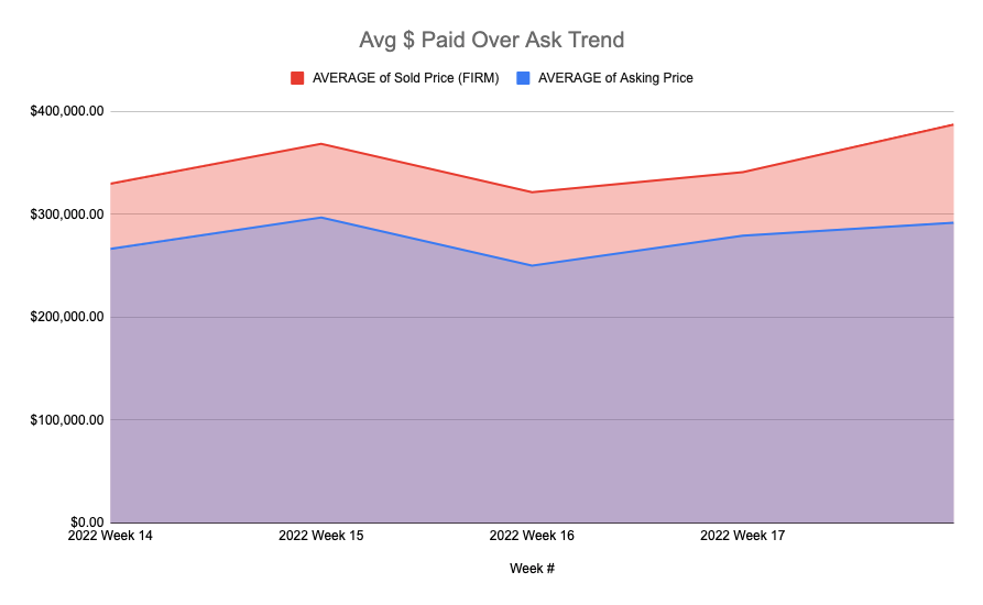
Weekly Over Ask $
The weekly chart shows the average dollar amount paid over the asking price. This week grew over last week.
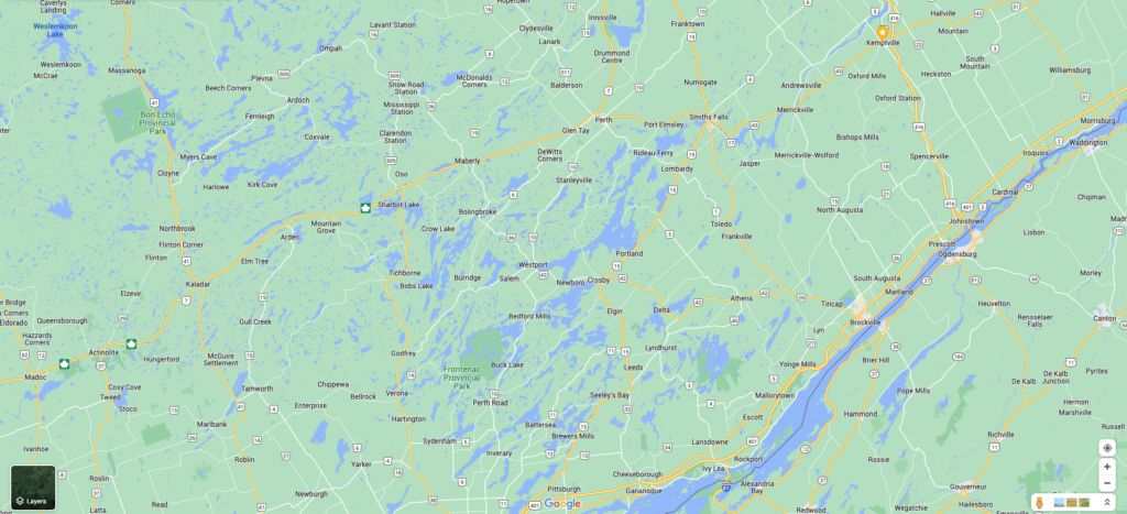
The Search Area
Below is an image of the search area used for this study. Some of the bigger cities included in these numbers are Kemptville, Prescott, Brockville, Gananoque, Smiths Falls, and Perth.
Hope this helps!